I have been itching to make a starry night card for a while. I love the dark, yet vibrant colors.

Thank for looking at my creation!!!
 Also posted in Word Art Wednesday #240-#241 Anything Goes










July 23rd, 2016 klwade Posted in Cardmaking, Crafts, Stamp-a-Faire 4 Comments »
I have been itching to make a starry night card for a while. I love the dark, yet vibrant colors.
Thank for looking at my creation!!!
Also posted in Word Art Wednesday #240-#241 Anything Goes
July 21st, 2016 klwade Posted in Cardmaking, Crafts No Comments »
Oh my goodness. I finished. Nothing like a deadline to pump those creative juices.
For this background I added a bunch of little stamps from the tropical themed sets.
I water colored the images and then realized. Dang I did not use water color paper.
So I decided instead of starting over, I switched to color pencils.
Nothing like a deadline to help you make quick decisions! LOL

I tried to get the background to look like a tropical sunset/sunrise.
It actually looks better in person. Clearly not my favorite of my cards, but cute enough.

Thanks for looking at my creation.
July 21st, 2016 klwade Posted in Cardmaking, Crafts No Comments »
Oh my goodness, I am sooo running out of time. I am designing and making cards as fast as I can.
Usually when I go fast I find that my cards lack a little something.
However this card came out cute.

I used the fishnet background die and colored the background with different blue and green distress ink.
I then used a shimmer mist over the top.
I used the awesome Fish Life stamp set for the coral and two fishes.
I added some clear droplets as fish bubbles to the page.

Thanks for looking at my creation.
July 21st, 2016 klwade Posted in Cardmaking, Crafts No Comments »
Inlaid made easy….my butt.
I fought this thing to the very end.
Oh well, at least I like how it came out.

I used gold foil for the stars and matte silver for the word star.
I then splattered water on the card and added embossing powder. This was a cool technique I just learned for the recent Online Card Class. I love the splattered look.
I also splattered white paint to give it more of a celestial feel.
Considering this card fought me to the very end, I really like the result.

Thanks for looking at my creation!
July 21st, 2016 klwade Posted in Cardmaking, Crafts No Comments »
I really wanted to use the My Favorite Things Bundle of Blossoms background stamp for this project.

This is a great project to color while watching (really listening) to tv.
I colored with prismacolor pencils and enhanced with some gel pens.

For the Thanks I used a soft matte silver cardstock. It looks white here but take my word for it.

Thanks for looking at my creations.
July 21st, 2016 klwade Posted in Cardmaking, Crafts No Comments »
It is time for the Camp Create cards. I am wayyyy behind as I was finishing the Online Card Class cards. So now in two days I will create 5 great cards.

I really like these Camp Create ideas and it makes me try new techniques. For today I am doing Fantastic Foiling!
I had some Anna Griffin French Inspired Minc Foiling that I thought would be cute with the little chef from My Favorite Things

The Eiffel Tower and Paris flag are foiled, but you cannot tell by this photo. Here is a close up to show the colors.

As you can see the tower is red and the flag blue.
Vive La France!!!!

Thanks for looking at my creations!!!!
July 19th, 2016 klwade Posted in Cardmaking, Crafts, Online Card Class, Simon Says Stamp Card Kit 3 Comments »
Well it comes as no surprise to me that I have been so busy and not inspired to do any cards lately. However that does not mean that there are deadlines to upload images and new card kits coming. So get a move on girl!!! I decided to do the homework from the Online Card Class Heat Wave from the SSS July 2016 card kit, killing two birds with one stone. I had sketched out the ideas for my cards so it was easy to add the techniques from the Heat Wave Class to my ideas.

Take this kit……and add this class

and you get 7 cards from one kit.

First day of class taught us some basics on embossing as well as some interesting techniques. The following card is just simple embossing on watercolor paper.
I tried to get the illusion of leaves floating on some water. Very Zen like. Calm.

Also on the first day of class, they showed us several techniques. Some I tried, others I wanted too but did not have the time.
The first technique (which I have done before) is embossing a die cut.
In this card I used the paper from the kit that had a lot of triangles. I added additional triangles and heat embossed an entire die cut.

I used some WOW copper colored embossing powder. I stamped some additional triangles that were a scribble look and added some bling.
Here is a close up of the die cut.

Another technique they used was glitter embossing powder.
I copic colored the small panel underneath and then covered the whole thing with versamark and some glittery embossing powder.

It is hard to see how pretty the card looks with the shimmer over the copics.
The final card from day one was embossing on something besides cardstock. I decided to use wood veneer to make this card.

The wood cracked and split on the bottom thru the flower. I am not sure if the heat was too much for the wood, or if it was a user error. Most times it is me making a mistake. I still like the card. I think the stark white on the wood is very pretty.
On Day Two, Jennifer showed us some pretty techniques that can add detail to your cards.
I used the technique of a small strip of double sided tape and embossed it with pink powder.

I masked off the middle and stamped the flowers using a mask so the images did not overlap. I then colored the card with some colored pencils.
She also showed a technique of splattering water and embossing over the wet area.
I really like this technique. I took the paper that already had the purple splatters and added gold splatters.

She also did the technique of using a glue pen to make little dots to add additional embossing to fill out a space or enhance an image. I ended up doing that on the vellum window.

You can see the sequins captured behind the vellum to make this shaker card.
On the last day we learned about ironing off embossing powder to create a look. But the project that caught my eye was the batik looking card.
I used the stamp set to create a background and embossed in white. The after the fold and refold process I used three shades of purple distress ink.

I always ask my brother to rank the cards and this was his favorite. His logic: Today I like purple.
Overall I enjoyed the class and I liked this card kit.
I hope you enjoyed looking at my creations!
 Posted in the Online Card Class Heat Wave
Posted in the Word Art Wednesday Challenge #238-239 Anything Goes
Posted in the Simon Says Stamp Card Kit Gallery – July 2016
July 4th, 2016 klwade Posted in Cardmaking, Crafts, Simon Says Stamp Card Kit 7 Comments »
I have been challenging myself to finish old Simon Says Stamp Kits. Of course I had no interest in doing Christmas cards or Valentine cards. So I was lucky to find a summer card theme.This August 2015 card kit screams summer.
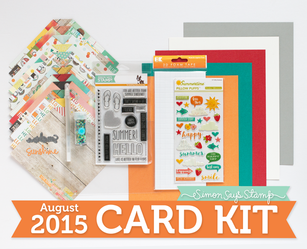

So let’s just jump into looking at the cards

I love this card. I made a watercolor beach with the flip-flops. I embossed the crashing waves and used small bronze dots for the sand. I really like the way it came out.
A couple of folks asked me about the wave stamp. It is from Papertrey Ink called
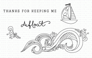
A great set for $5.00

I went for a clean and simple look with this card. I used the stamp on 5 different pages and die-cut the Sunshine out of shiny gold paper.

Here is a close-up. I also added glossy accents on the letters.

When I started this card I did not have high hopes. But as I was working on it, I started to love it. Especially when I noticed that the puffy stickers were mirror images. So when I stuck them on the end of the cord they matched up perfectly. I made the waves out of cork so it looked more beachy. I really like this card.

Here is a close up of the puffy stickers.

When I saw this paper, I really liked the sun burst in the middle. When I laid the margarita die on the top of it I liked how it seem to radiate.
I used the 100% happy stamp on the inside of the glass so when you tipped the sequins you can see the image.

Here is a close-up of the glass so you can see the stamp.

I used a stencil on this card. I colored the embossing paste with ink to have a graduated sunray look.

I will be honest. I did not like this card. I loved the paper but it did not sing to me. But it still made the cut.

Last but not least, a shaker card. I stamped SUMMER on the clear acetate. and added sequins that matched the paper.
Thanks for looking at my SEVEN cards from ONE Kit!
 Posted in the Simon Says Stamp Wednesday Challenge – Anything Goes
Posted in the Word Art Wednesday Challenge – Anything Goes #236-237
 Posted in Dies R Us Challenge #52 Outdoor Fun
June 26th, 2016 klwade Posted in Cardmaking No Comments »
I wanted to try to add two more patterned paper cards.
I felt really unproductive today and making cards will automatically make me productive. Right??
My first card was a overlay of mountain scenes with a little camper. I really liked this camping paper that I bought the other day. What is it with me and camping. Must mean I want to go.

My second card is from the same paper pack. It was some feathers on a kraft colored paper. I recently bought some gold Inka Gold and I wanted to play with it. I used a stencil over the paper and added a paper cut feather and a real feather dipped in gold glitter.

It is a little hard to see the quote. So here is a close up.

Thanks for looking.
Posted in Simon Says Stamp Monday Challenge – Patterned Paper

Posted in Simon Says Stamp Wednesday Challenge – Add some Shimmer
Posted in Word Art Wednesday Challenge #236-237 Anything Goes
Thanks for looking.
June 26th, 2016 klwade Posted in Cardmaking No Comments »
I wanted to try the reverse stenciling card on the Papertrey Ink Make It Monday Challenge #253.
I thought it would be easy.
I was wrong.
I started with the Hero Arts Bold Floral stencil. In my mind it would be a beautiful background of floral prints with some special floral arrangements on top.
The angels would sing to the glory of my creation! It looked horrible. I should have taken a before shot. Really, it was bad.
I picture the angels walking away, wings drooping, heads shaking in disappointment.
It looked blotchy and sad against the white background. So I decided to ink over the whole card front hoping to make everything blend together.
Now it look like a blotchy card with ink on it.
Big Sigh!
I finally blended ink making sure I was color matching each flower. OK now it looked better. Then I water spritzed it. Much better. Used a border die to tidy up the edges. Even better.
I stamped out some florals. Egads. They looked horrible on the card. I tried every trick in the book. I finally die cut a Papertrey Swirly pattern in a copper shine paper and I really liked it.
The florals still looked horrible.
I ditched the florals and did a Boutique Border and embossed it in a copper/bronze powder. Ok, that looked better.
I finally put it all together and called it a day.
Days it took to design and re-design the card – 4 days
Number of die cuts not used in the card: 8
Hours of frustration and thinking about the card: 16
Number of Angels smiling at my final creation: Priceless

Thanks for looking:
Posted in Papertrey Inks Make it Monday #253 Reverse Stenciling
Posted in Word Art Wednesday #236-237 Anything Goes
Posted in Simon Says Stamp Wednesday Challenge – Add Some Shimmer
